10 rules for designing a brand led website - for beginners
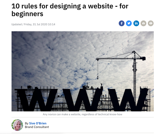
No website and no idea where to start? Did you know, these days, any novice can make a website, regardless of technical know-how. It may sound daunting, but thanks to a choice of website builders, it's so much easier than you think. Whether you’re new to the web, have an existing business you need to promote, products or services to sell, even a long-forgotten site that needs a makeover, it’s never been easier. Sive O'Brien gives a quick-start guide to building a website from scratch.
1. Find the right website builder for you
So you’re not technically savvy, but you need an affordable website? Newbies attempting to design a website in a short space of time should steer clear of Wordpress as it takes time to navigate and may require a web developer to help build and manage it once it has been designed. Look to one of these easy-to-use website builders like Wix, Squarespace or Shopify. Research which one is best for you, your skills and your industry. Wix and Squarespace have free and paid plans for well laid-out and professional-looking sites that are easy to customise, as well as 24/7 support and tutorials. Shopify is the most user-friendly choice for selling products online and comes with a host of free and paid templates to help you sell and process orders easily. It links up your online store with Facebook shopping too. But, with this super-e-commerce platform comes a price as they charge a small fee on every item you sell.
2. Your domain name
This is [yoursitename].com/ie web address by which all your many customers will find you. Put simply; it puts a friendly face on a hard-to-remember numeric internet address (also known as your IP address). Buying a name is an easy process with a web domain and hosting provider like Register365, Letshost or Godaddy - it’s finding one that hasn’t been used that’s the tricky part. If you don’t already have a domain name, remember, to make it count.
A few rules of thumb include:
Make it relevant to your business and industry.
Keep it memorable and short.
Avoid numbers in your name.
Avoid using a name that is already used in other countries or businesses.
Check that it is available on social media, you’ll want a consistent brand name across all marketing channels.
3. Establish your website's identity
Now, it’s time to get the creative juices flowing. First off, do your research. What are your competitors doing online? Do you find some sites easy to navigate? What about your logo, the typography and the colour scheme? The look and feel of your site should be in keeping with your brand and consistent across all sections, unifying the pages. You’ll need a Favicon too, a site icon that is a smaller version of your logo, it appears next to your website name on a browser tab.
4. Design the homepage
This is the focal point of your entire website. It should set the tone for your brand, contain all the relevant messaging in one scrollable page with buttons, menu options (keep these to a minimum) and visual cues to direct people to more detailed pages. Keep choices to a minimum. Keep Hick’s Law in mind, which states that by increasing the number of choices, the time it takes for a person to make a decision increases.
5. Focus on your header
Design above the fold, this refers to the bottom border of the browser. Your hero image or video should be at the top of your homepage. 75% of all your website work comes down to your main header image and text on the landing page - it’s what greets people when they land on your website so think of it as your aspirational identity, a.k.a. your most powerful sales tool. Put simply; your header should offer the customer something, the value of what you sell. This page alone has the ability to sell a potential customer something that they want or want to become, something your brand can deliver. It’s your customer’s vision of the future with your product or service in it. The brief text should tell customers what you do and also include makes you different, the value added to your service or product, and a call-to-action button, leading them to purchase or contact you.
6. Resolve the problem
Underneath your hero image, place your 'Value Stack.’ Usually, three sections with an icon explaining the value the brand brings. These icons help focus additional attention on these three points. The text should also define the problem the potential customer is having, so you can state how you can resolve that problem for them. Either in the ‘Value Stack’ or underneath you should add text that expresses empathy, state that you care about their problems, show your authority, demonstrate competency to solve the customer’s problems.
7. Avoid clutter
People don’t read websites; they scan them. Use headlines, bolded text and lists rather than too much text. A surefire way of preventing customers from buying from you is to clutter your website and confuse potential customers. Less is always more; white space is your friend. Think about simple, pared-back sections, always leading customers to the next step.
8. Encourage scrolling not clicking
Apart from the call-to-action button on your landing page, scrolling down the main landing page of your website is a lot easier than having to click into other pages. Scrolling is more intuitive for the user, and it also means they may stay on your site for longer. Have a brief summary of your business, location, what you offer and why you offer it, on the main landing page. The user can click further into pages for more details. Conversion rates tend to be higher when you include more in your scroll than having to click into separate pages.
9. Keep imagery in line with your offering
Your imagery is everything. If photoshoots or product imagery is out-of-reach for your budget, look to free stock images that reflect your brand to illustrate your pages. You’ll be surprised how many beautiful images are available to use on sites like unsplash, pexels, pixabay and morguefile. Just remember to give the photographer a goodwill mention either on a website page or on social media when you use an image.
10. Design for mobile
Design your website layout with mobile usage in mind. Around half of all your website visits are via mobiles. The key is to make sure it looks equally as beautiful on mobile as on desktop. Remember, your website on desktop will be generously proportioned compared to mobile, so check each design stage on both mediums and on different devices to make sure it looks just as good no matter how people are viewing your website.
This post first appeared on RTE’s Boost My Business section. Catch-up with all my brand development features on RTE.IE HERE.